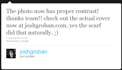
Looks like the crew at JG.com had a bit of a problem when they uploaded the cover art to the website. But it's all fixed now... Gotta say I like this new & improved version.
(BTW - does anyone else see the irony in the fact that the cover for "Illuminations" was too dark. LOL)
(BTW - does anyone else see the irony in the fact that the cover for "Illuminations" was too dark. LOL)
And here are Josh's tweets about it.
Source 1
Source 2


Like the 'lighter' version much better.
ReplyDeleteHey, I think it's very very good to see the eyes! :)
ReplyDelete